Whats the difference between AP1 and AP2 graphs
SoccerScanner’s Attacking Pressure graphs are unique visual tools that track a team’s offensive momentum over the last 10 minutes of play. When attacking pressure is high, the figures are shaded in green, making it easy to spot shifts in dominance. The two graphs use different statistics related to attacking intent, which is why they give you different values
Why These Graphs Matter
These charts provide a real-time snapshot of how a match is unfolding, helping you interpret the flow of the game and anticipate potential goals.
Example 1: A Shift in Momentum
In this scenario, the match was fairly even until the 21st minute, when the home team scored first. However, from the 30th minute onward, the away team increased their attacking pressure significantly, suggesting they were pushing hard for an equalizer.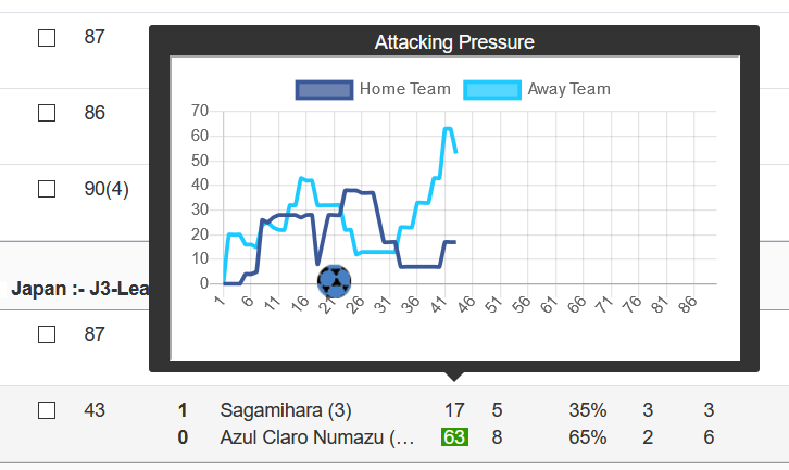
Example 2: Dominant Attacking Play
Here, the home team consistently dominated in terms of attacking intent. Their sustained pressure was eventually rewarded with two goals, reinforcing the value of tracking attacking momentum.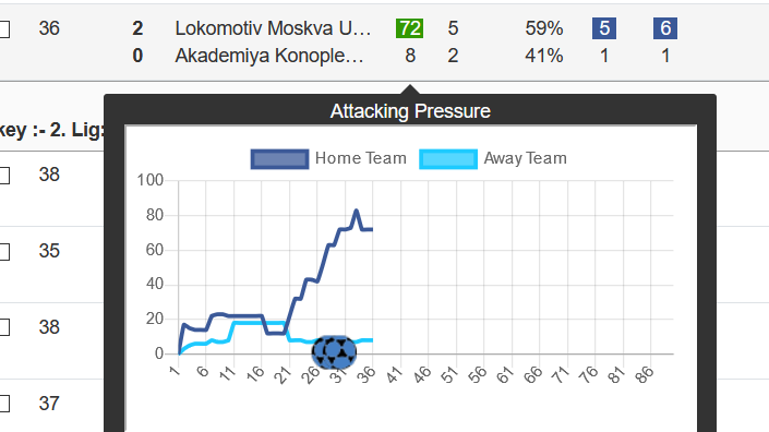
Using AP1 & AP2 for Alerts
When receiving an alert, checking AP1 is particularly useful:
✅ AP1 above 55 indicates strong attacking intent.
✅ AP2 above 16 suggests sustained pressure in key areas.
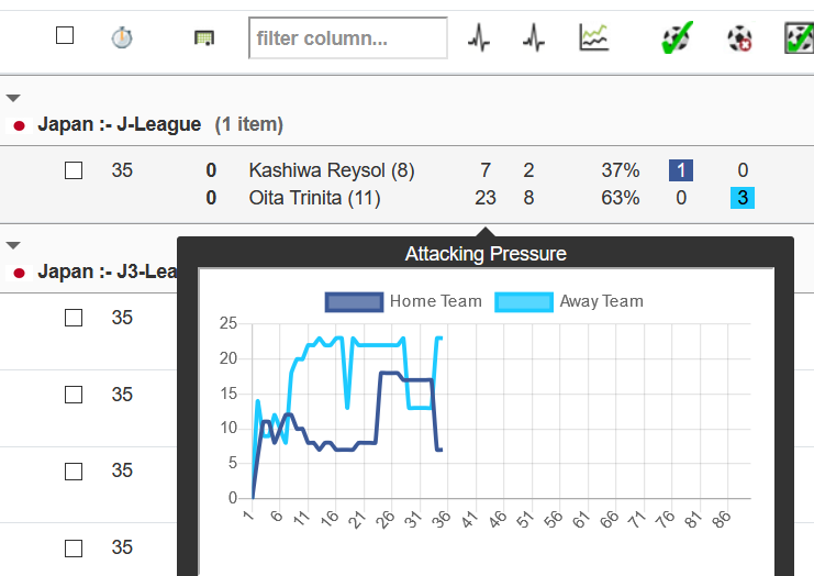
Example 3: Low Attacking Pressure
In this case, AP1 values were consistently low, resulting in a 0-0 scoreline with only one shot on target—a clear sign of a lacklustre attacking performance.
By understanding these graphs, you can make more informed betting decisions and refine your strategies based on real-time match dynamics.